
Intentional UI that speeds access to student support
Overview
Project overview
About our client
College Action Program (CAP) is a non-profit organization with the mission to support students achieve their higher education goals.
Project brief
Develop a mobile app for college-intending students that will motivated them to complete the enrollment process.
The problem
Approximately 40% of College-intending students fail to complete the college enrollment process because they lack information and access to help.
Project details
Roles
UX/UI Designer
Research Lead
Project Manager
Timeline
Three-Week Design Sprint
Platforms
iOS
Deliverables
The solution
Design a motivational app with an intuitive dashboard, visual status of progress, and accessible resources to guide student transition.
Mobile App Design
Design System
Animation Prototype
UI Library
The single source of truth to our design
Before we began on the wireframes, we created a design system to guide our design. The design system served as a comprehensive resource for consistent and efficient UI design.


Lo-Fidelity Wireframes
Building out the design backed by research
Once we had a better understanding of our user's needs and frustrations we proceeded to create initial wireframes with the following features in mind:
Onboarding


The banner provides words encouragement to motivate students to take action.
1. Motivational Banner
Financial Aid


Each step of the college enrollment process is delineated in video and written format.
4. Ample Information
Chatbot

6. Help
Users can click the AI to for quick responses to frequently asked questions.
Dashboard
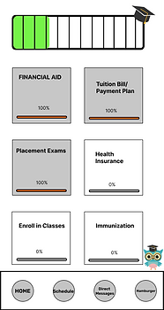
A visual indicator of how far they are in completing a specific step or the overall enrollment process.
2. Progress Bar
All tasks are organized in one place, students can easily find the information they need.
3. Intuitive Dashboard
Help


Students have multiple communication channels through which they can receive help and advice from mentors.
5. Guidance Resources
Calendar

Students can receive notifications that remind them of approaching deadlines in the matriculation process.
7. Task Management
Testing & Iterations
How does it work & what can we improve ?
We conducted usability tests to identify where we had to make revisions.
-
Issue: It was unclear to what the "overall" progress bar was.
-
Solution: Change to circular progress bar with a percentage.


1. Progress Bar


3. Navigation
-
Issue: The navigation bar was not intuitive. It was unclear where they would be taken.
-
Solution: Use icons that are more representative of the category.


2. Copywriting
-
Issue: Users had no idea "CAP Chat" button was a way to access help.
-
Solution: Label the button "Mentor," as it is more comprehensive.
4. Resources
-
Issue: Students need many resources not just the ability to message a mentor.
-
Solution: Have multiple resources available for students.


Final Prototype
A look into the final product
After more revisions, the high-fidelity prototype was created merging CAP's goals with our target users' needs.
Scenario 1
Sidney needs to register for financial aid. He looks for information on how to complete it.

Scenario 2
Sidney needs additional help, he wants to schedule a meeting with his mentor.

Key screens


Next Steps
Additional features for the future
Once the high-fidelity wireframes were done, we did one more round of usability test. If we had more time we would make the following changes.

1. Universal Icon
Gather more data to decide whether to use an symbol or an arrow on each information step. We want it to be clear for the user that if they press the button, it will direct them to more information.
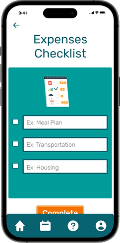
2. Customization
Adding a space for an amount in the expenses checklist and scholarships list so students can keep track of their expenses.


Once the student clicks the “complete” button a checkbox will automatically be appear on the information page. The student will no longer have to click it manually.
3. Automation
Reflection
Reflecting on my journey
From the start, I felt passionate about designing this app. I am overjoyed to have created something that will benefit underrepresented students. I will have played a role in giving students the opportunity to reach their higher education goals and that is priceless. I learned some valuable skills along the way that I will apply to my future work.
Reiterate the ask - After the initial meeting with the Client, each designer had a different understanding of what was asking being asked from us to create. Even though we recorded the conversation and were able to refer to notes, it was unclear what things were a requirements and what was a good to have. I learned that before ending a meeting, it is important to reiterate to the Client what is being asked and is expected to be accomplished.